Behind the Beats: Why This Project?
Ever wondered what makes a song a hit? Is it the beat, the energy, or just pure luck? Spotify’s top tracks from 2000–2019 are full of secrets hidden in plain sight — tempo, danceability, valence, energy, and other audio features all tell a story.
This project dives into two decades of music to decode the trends, moods, and patterns that shaped our playlists. Picture Spotify Wrapped, but powered by data — revealing hits, trends, and how our favourite tracks shaped the soundtrack of two decades.
Want to dig deeper? Checkout the full Jupyter Notebook here: https://github.com/raksha9917/spotify-wrapped-eda/blob/main/SpotifyEDA.ipynb
Tools of the Trade
Behind every great playlist analysis is a solid toolkit. For this project, I leaned on a few Python heavy-hitters to wrangle, clean, and visualise the data:
- Pandas & NumPy 🐼 ➝ The backbone of data analysis. They handled the heavy lifting — from checking for null values to transforming milliseconds into minutes and seconds.
- Matplotlib & Seaborn 📊 ➝ My go-to libraries for plotting. Together, they turned raw numbers into sleek visualisations — bar charts, scatterplots, KDEs, and heatmaps that made trends easy to spot.
- Plotly 🎨 ➝ For interactive charts that make exploring the data feel less like homework and more like a Spotify feature.
- Jupyter Notebook 💻 ➝ The stage where all the analysis happened. It let me write code, test visuals, and narrate the process step by step in one place.
Think of it this way: Pandas organised the playlist, Seaborn/Matplotlib spun the visuals, and Jupyter Notebook was the DJ booth where it all came together.
💡 This setup is lightweight, beginner-friendly, and perfect for EDA projects — no complex deep learning models needed, just smart use of Python’s best libraries.
Data Tune-Up
Before we can decode the hits, we need to meet the data. The dataset spans 2000–2019 and includes Spotify’s top tracks, packed with details on artists, genres, song duration, popularity, and a variety of audio features like danceability, energy, valence, tempo, acoustics, and loudness.
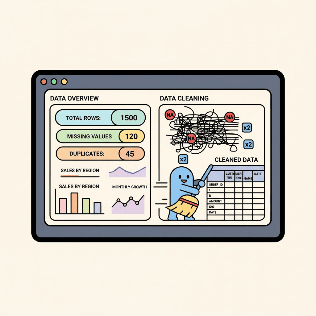
Raw data is like an unmastered track — it needs tuning. I started by checking for missing values and duplicates, making sure every song had its rightful place. Then, I converted the duration from milliseconds to minutes and seconds, because “210000 ms” isn’t exactly playlist-friendly.
To make plotting and analysis smoother, I also created a subset of DataFrames for categories like top genres and minor/major key indicators. Additionally, I simplified labels for plotting for ease of understanding. With the dataset cleaned, organised, and tuned up, we’re ready to explore trends, moods, and hidden patterns that reveal what really makes a song a hit.
Decoding the Charts
With the dataset tuned up and ready, it was time to press play on the analysis. Numbers on their own don’t mean much — but when we turn them into visuals, the story of two decades of music really starts to sing. Here’s what the data revealed:
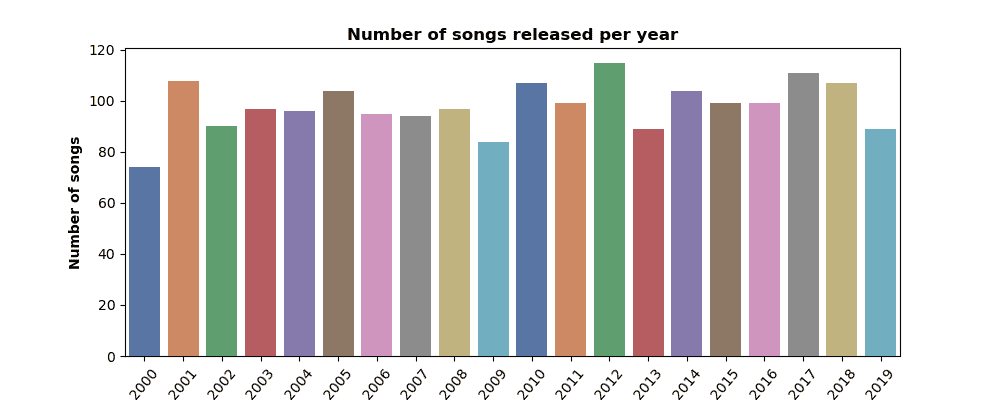
🎶 Hits Over the Years
Some years cranked out endless bangers, while others were a little quieter. Plotting the number of songs released per year showed how the 2010s in particular were stacked with chart-toppers — a true golden era for streaming playlists.
👑 Who Ruled the Charts?
Certain artists didn’t just appear once — they dominated. From pop icons to rap powerhouses, a few names popped up again and again, proving they weren’t just one-hit wonders but era-defining stars.
Rihanna topped the charts! ✨

⏱ The Shrinking Song
The average song duration tells an interesting story: hits have been getting shorter. Gone are the days of sprawling 5-minute anthems — in the age of streaming, it’s all about quick hooks and replay value.

🎭 Major vs. Minor Moods
Turns out, the charts like to keep it bright. Major keys dominate, giving us feel-good jams that make summer road trips and party playlists unforgettable. Minor keys sneak in with their moody vibes — perfect for late-night drives, but when it comes to top hits, the sunny songs usually win.

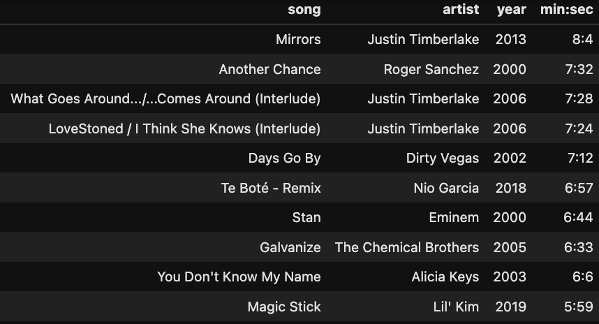
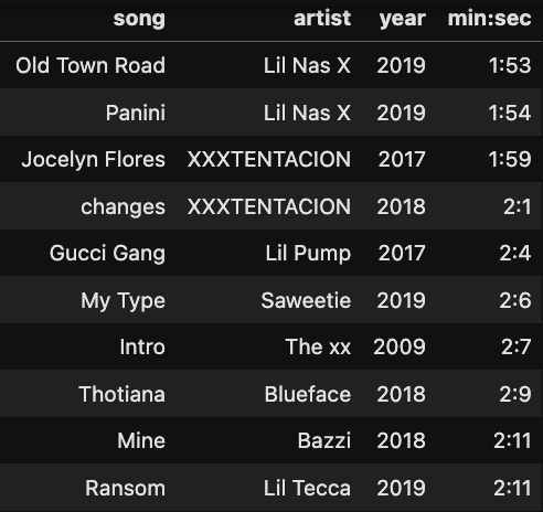
⏳ The Extremes: Longest vs. Shortest Hits
Finally, the outliers. Some songs barely clocked in as a snack-sized track, while others felt like a full meal. From blink-and-you’ll-miss-it hits to marathon anthems, the charts always have room for both
Topping the longest songs list was Mirrors by Justin Timberlake — clocking in at 8.04 minutes, a timeless classic. 💎
On the flip side, Old Town Road by Lil Nas X barely hit 1:53 — proof that sometimes the shortest tracks make the biggest waves! 🌊
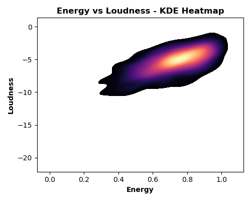
🔊 Energy Meets Loudness
Ever wondered if volume = energy on the charts? To find out, I made a KDE heatmap — basically a musical density map showing where most hits hang out.
Spoiler: high-energy tracks do tend to crank up the volume, forming bright “hotspots” on the chart. A Pearson correlation of 0.654 backs it up — there’s a solid positive relationship. But here’s the fun part: some tracks bring serious hype without blasting your eardrums, proving that you can still dance hard even at moderate volume.
💡 KDE in action: Think of it as a crowd map for songs — you instantly see where the majority of hits cluster without getting lost in a sea of dots.
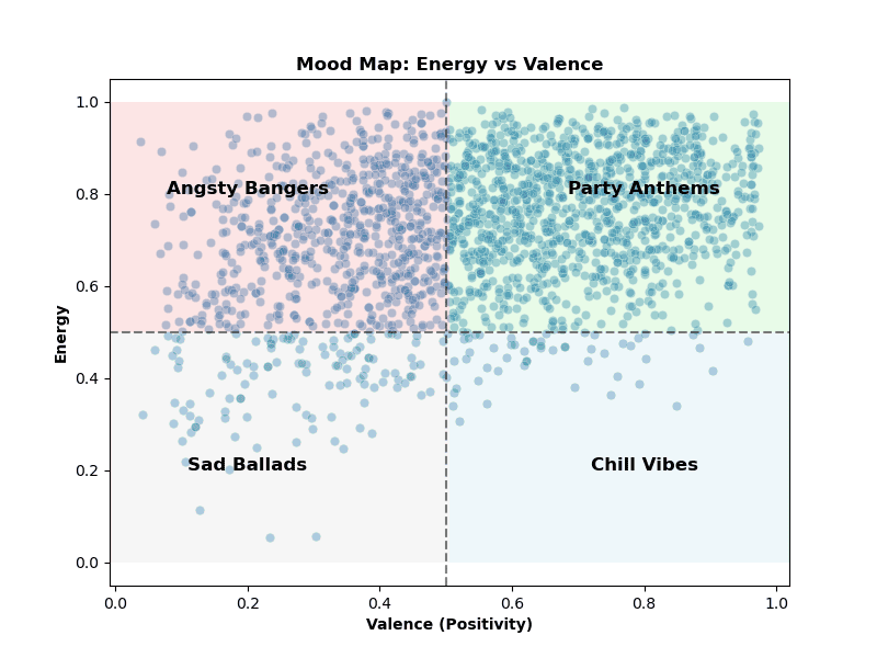
🎹 Mood Quadrant: Where Hits Hangout
To see how songs make us feel, I mapped them across a mood quadrant chart using valence (positivity) and energy.
The result? Most hits live in the high-energy, high-valence corner— basically the ‘Angsty Bangers’ and ‘Party Anthems’. But the chart also shows some surprises: moody or introspective tracks sneak into the low-valence quadrants (the ‘Sad Ballads’ and ‘Chill Vibes’), proving that even sad songs can leave a mark on the charts. Meanwhile, chill yet happy tunes occupy the low-energy, high-valence zone, perfect for relaxing playlists.
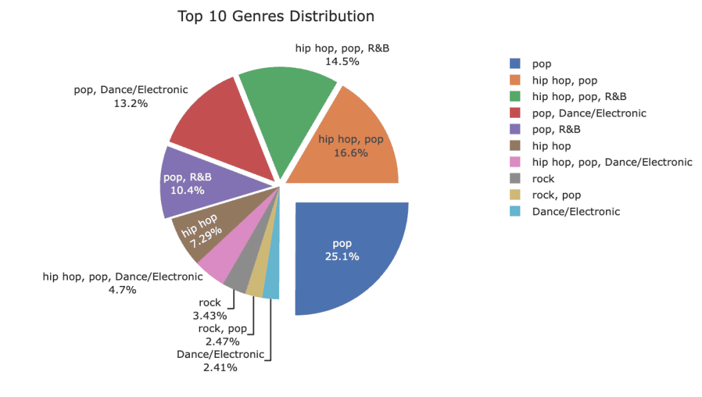
🎧 Genre Evolution: How Our Playlists Shifted
Music tastes don’t stay still, and the charts prove it. Using a stacked area plot, we can see how genres rose and fell from 2000 to 2019.

Pop still reigns supreme, but the 2010s brought a surge of hip-hop, EDM, and alternative tracks, reshaping the playlist landscape. Watching the areas grow and shrink over time feels like flipping through a musical timeline — some classics never go out of style, while new genres make bold debuts.
To complement the area chart, a pie chart of the top 10 genres shows their overall share in the dataset, making it easy to see which styles dominated the decade as a whole. Pop grabs the biggest slice, while hip-hop, EDM, and alternative make up a flavourful mix of hits that defined our playlists.
📊 The Anatomy of a Hit
To peek under the hood of top hits, I created violin plots for audio features like danceability, acousticness, speechiness, energy, and valence. These plots don’t just show averages — they reveal the full distribution, letting us see where most hits cluster and where the outliers live.
The story is clear: crowd-pleasers tend to be highly danceable and energetic, while tracks heavy on acoustic or speech-like elements are rare in the mainstream. You can literally see the peaks in the violins where hit-making magic happens, giving a visual fingerprint of what makes a song resonate with listeners.
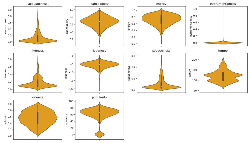
💡 Why this plot hits the right note: Unlike histograms, they show both the shape and spread of the data, making it easy to spot trends and extremes — perfect for understanding the DNA of a hit.
🔗 When Features Collide
Ever wonder which musical traits love hanging out together? A correlation heatmap shows just that, revealing which audio features tend to move in sync.
Not surprisingly, energy and loudness are practically BFFs, while danceability and acousticness keep their distance on opposite ends of the spectrum. It’s like seeing the social network of a hit song — who vibes together, who chills solo, and what makes a track resonate with listeners.

💡 Reading the friendship map: They turn a jumble of numbers into a visual friendship map of your audio features, letting you instantly spot patterns and relationships.
🎵 Final Notes: What the Data Tells Us
After diving into two decades of Spotify’s top hits, a few things are clear: hits are getting shorter, punchier, and more danceable, major keys still dominate the charts, and while pop reigns supreme, genres like hip-hop, EDM, and alternative reshaped the musical landscape.

Audio features like energy, loudness, and valence aren’t just numbers — they tell the story of what makes a song resonate, and KDEs, violin plots, and heatmaps help us see patterns hidden in the noise.
Whether you’re a data nerd or a music fan, this project proves that the soundtrack of our lives has structure, trends, and surprises — and sometimes the quietest or saddest track can leave as big a mark as the chart-topping banger.
💡 Takeaway: Data doesn’t just reveal what we listen to — it shows why we love it!

Leave a comment