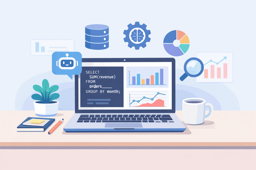
AI tools are everywhere in data analytics now. From writing SQL to explaining a messy dataframe, tools like ChatGPT and Gemini have quietly become the intern who never sleeps. But here is the reality. The quality of what you get in return depends heavily on how you ask.
Prompt engineering sounds technical, but for data analytics it is mostly about asking clearer, more practical questions.
It is not about fancy wording or clever tricks. It is about being specific, structured, and intentional. In analytics especially, a small change in how you phrase a request can be the difference between a vague answer and something genuinely useful.
Let us break it down.
What Is Prompt Engineering?
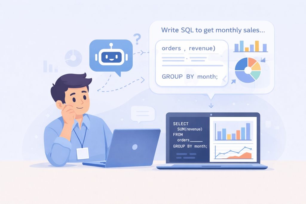
At its core, prompt engineering is the skill of asking AI the right question in the right way.
For data analytics, this means:
Giving enough context about the data
Being specific about the task
Defining constraints and assumptions
Asking for output in a usable format
Think of AI like a knowledgeable analyst who has never seen your dataset before. If your instructions are unclear, it will still try to help, but the output will likely be generic or slightly off. You don’t want answers that are a result of a hallucination.
Why Prompt Engineering Matters for Data Analysts
Data analytics is rarely about one perfect answer. It is about exploration, validation, and iteration. AI can support all of that, but only if it understands what you are trying to do.
Translate business questions into analytical logic
Explain insights clearly to non-technical stakeholders
Sense-check your thinking before presenting results
Bad prompts can lead to hallucinated columns, incorrect logic, or answers that sound confident but are wrong. That is a risk no analyst wants.
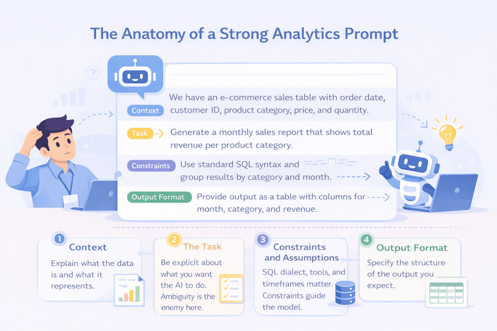
The Anatomy of a Strong Analytics Prompt
A strong prompt usually includes four parts:
1. Context: Explain what the data is and what it represents.
2. The Task: Be explicit about what you want the AI to do. Ambiguity is the enemy here.
3. Constraints and Assumptions: This is where most people fall short. SQL dialect, tools, timeframes, and limitations all matter. Constraints guide the model and reduce nonsense.
4. Output Format: If you do not specify the format, you will get whatever the model feels like giving. This matters a lot when you plan to reuse the output directly in your workflow.
Common Prompt Engineering Mistakes Analysts Make
Even experienced analysts trip up here.
Some common mistakes:
Asking multiple unrelated tasks in one prompt
Forgetting to specify the SQL dialect
Blindly trusting outputs without validation
Not correcting the AI when it makes assumptions
Treating AI as a source of truth instead of a collaborator
AI sounds confident by default. You still need to think critically.
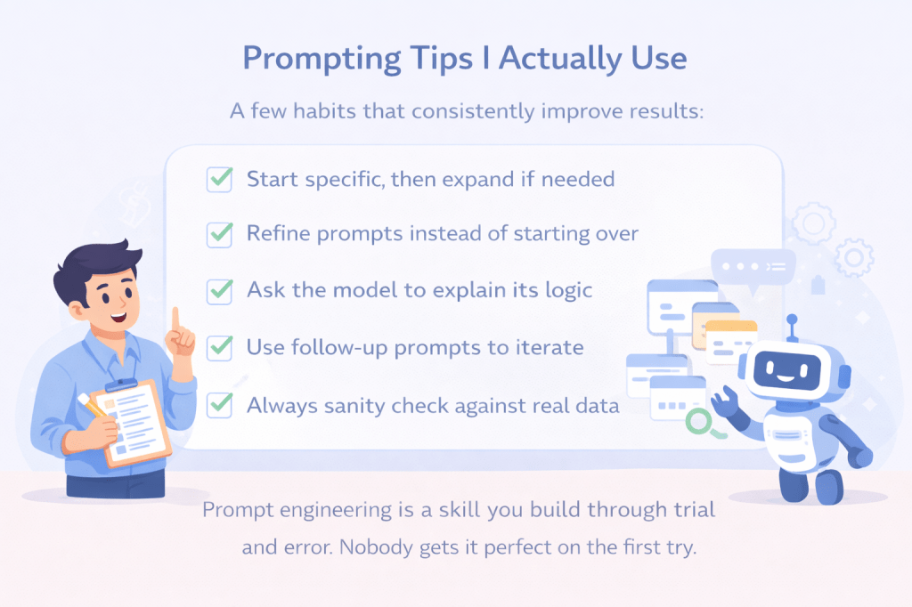
Prompting Tips I Actually Use
A few habits that consistently improve results:
Start specific, then expand if needed
Refine prompts instead of starting over
Ask the model to explain its logic
Use follow-up prompts to iterate
Always sanity check against real data
Prompt engineering is a skill you build through trial and error. Nobody gets it perfect on the first try.
Final Thoughts
Prompt engineering is not a replacement for analytical thinking. It is a multiplier.
When used well, AI becomes a powerful assistant that speeds up your workflow, challenges your assumptions, and helps you communicate insights more clearly. When used poorly, it becomes noise.
As data analysts, our job is not just to get answers. It is to ask better questions. Prompt engineering is simply an extension of that skill.
Every time a shiny new technology shows up, the same question pops up: “Is this going to take my job?” Cue the dramatic music. AI is the latest in the lineup, and yes — it’s moving fast.
From chatbots to predictive analytics, it’s revolutionising industries everywhere. But here’s the twist: AI isn’t your rival. It’s your ride-or-die sidekick. Your co-pilot. The real divide will be between those analysts who strap in and take off with AI and those still stuck at the gates.
The Myth of AI as a Job Killer
Here’s the thing: AI’s a great autopilot. It works well with automated, repetitive tasks —cleaning messy datasets, flagging anomalies, and generating reports without breaking a sweat. But this is just the mechanical side of analysis. The real magic happens when an analyst interprets the data, connects it to business goals, and turns insights into action.
AI can crunch numbers, but it can’t decide which metric matters most, prioritise trade-offs, or craft a strategy that actually moves the needle. Analysts aren’t being replaced; they’re being empowered to focus on the work that truly drives impact.
If you’ve read my post on AI’s Jagged Frontier, you know that AI’s capabilities are impressive but uneven. It excels at tasks that are structured, repetitive, or data-heavy — like cleaning datasets, spotting anomalies, or generating quick reports. But the frontier is jagged: AI struggles with nuance, context, and judgment. That’s exactly why analysts remain indispensable. Machines can automate routine work, but only humans can interpret insights, prioritise trade-offs, and decide which strategic direction will create real impact. AI isn’t here to replace analysts; it’s here to complement them, filling in the gaps while leaving the high-level decision-making in human hands.
From Data Crunchers to Insight Leaders
Think back five years: analysts spent hours wrangling spreadsheets, reconciling data, and building dashboards. Today, AI takes over that grunt work. That frees analysts to do what machines can’t: ask sharper questions, identify patterns others miss, and guide executives toward better decisions. AI handles the autopilot tasks, while analysts steer the plane. The role isn’t shrinking — it’s evolving into something far more strategic and efficient.
Across industries — from marketing campaigns to financial risk analysis to healthcare data — AI handles the heavy lifting while analysts steer strategy and make the calls that drive real impact.
The Superpowers of an AI-Enabled Analyst
AI doesn’t take the wheel — it handles the grunt work, freeing you to focus on the insights and decisions that actually drive business impact.
With AI riding shotgun, analysts suddenly gain superpowers:
Speed: Turn data into insights in minutes instead of days.
Scale: Analyse millions of data points without breaking a sweat.
Prediction: Stop reporting history and start forecasting the future.
Storytelling: Transform raw numbers into narratives that drive impact.
AI isn’t replacing analysts — it’s amplifying their impact. By taking care of the repetitive tasks, AI lets analysts focus on high-value decisions, turning them into insight leaders who can navigate complex business challenges with confidence.
The New Analyst Mindset
To thrive in this era, analysts need more than technical chops. Curiosity, critical thinking, and storytelling are just as important as knowing how to run a model. Analysts must also know when to trust AI and when to challenge it.
The best analysts don’t just interpret data — they translate it into action, bridging insights and strategy to shape outcomes that truly matter.
Ready for Takeoff?
AI isn’t your competition — it’s your co-pilot. Analysts who embrace it will take the controls, chart new courses, and soar to new heights. Those who resist? They’ll be left on the tarmac. The question isn’t whether AI will reshape analytics — it already has. The real question is: are you ready to take off?
Ever wondered what makes a song a hit? Is it the beat, the energy, or just pure luck? Spotify’s top tracks from 2000–2019 are full of secrets hidden in plain sight — tempo, danceability, valence, energy, and other audio features all tell a story.
This project dives into two decades of music to decode the trends, moods, and patterns that shaped our playlists. Picture Spotify Wrapped, but powered by data — revealing hits, trends, and how our favourite tracks shaped the soundtrack of two decades.
Behind every great playlist analysis is a solid toolkit. For this project, I leaned on a few Python heavy-hitters to wrangle, clean, and visualise the data:
Pandas & NumPy 🐼 ➝ The backbone of data analysis. They handled the heavy lifting — from checking for null values to transforming milliseconds into minutes and seconds.
Matplotlib & Seaborn 📊 ➝ My go-to libraries for plotting. Together, they turned raw numbers into sleek visualisations — bar charts, scatterplots, KDEs, and heatmaps that made trends easy to spot.
Plotly 🎨 ➝ For interactive charts that make exploring the data feel less like homework and more like a Spotify feature.
Jupyter Notebook 💻 ➝ The stage where all the analysis happened. It let me write code, test visuals, and narrate the process step by step in one place.
Think of it this way: Pandas organised the playlist, Seaborn/Matplotlib spun the visuals, and Jupyter Notebook was the DJ booth where it all came together.
💡 This setup is lightweight, beginner-friendly, and perfect for EDA projects — no complex deep learning models needed, just smart use of Python’s best libraries.
Data Tune-Up
Before we can decode the hits, we need to meet the data. The dataset spans 2000–2019 and includes Spotify’s top tracks, packed with details on artists, genres, song duration, popularity, and a variety of audio features like danceability, energy, valence, tempo, acoustics, and loudness.
Raw data is like an unmastered track — it needs tuning. I started by checking for missing values and duplicates, making sure every song had its rightful place. Then, I converted the duration from milliseconds to minutes and seconds, because “210000 ms” isn’t exactly playlist-friendly.
To make plotting and analysis smoother, I also created a subset of DataFrames for categories like top genres and minor/major key indicators. Additionally, I simplified labels for plotting for ease of understanding. With the dataset cleaned, organised, and tuned up, we’re ready to explore trends, moods, and hidden patterns that reveal what really makes a song a hit.
Decoding the Charts
With the dataset tuned up and ready, it was time to press play on the analysis. Numbers on their own don’t mean much — but when we turn them into visuals, the story of two decades of music really starts to sing. Here’s what the data revealed:
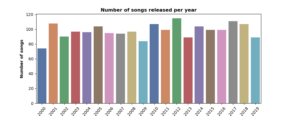
🎶 Hits Over the Years
Some years cranked out endless bangers, while others were a little quieter. Plotting the number of songs released per year showed how the 2010s in particular were stacked with chart-toppers — a true golden era for streaming playlists.
👑 Who Ruled the Charts?
Certain artists didn’t just appear once — they dominated. From pop icons to rap powerhouses, a few names popped up again and again, proving they weren’t just one-hit wonders but era-defining stars.
Rihanna topped the charts! ✨
⏱ The Shrinking Song
The average song duration tells an interesting story: hits have been getting shorter. Gone are the days of sprawling 5-minute anthems — in the age of streaming, it’s all about quick hooks and replay value.
🎭 Major vs. Minor Moods
Turns out, the charts like to keep it bright. Major keys dominate, giving us feel-good jams that make summer road trips and party playlists unforgettable. Minor keys sneak in with their moody vibes — perfect for late-night drives, but when it comes to top hits, the sunny songs usually win.
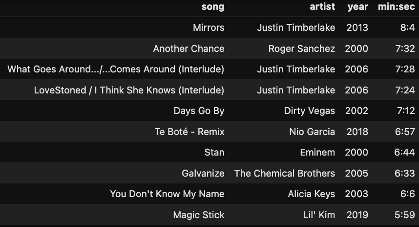
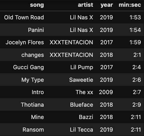
⏳ The Extremes: Longest vs. Shortest Hits
Finally, the outliers. Some songs barely clocked in as a snack-sized track, while others felt like a full meal. From blink-and-you’ll-miss-it hits to marathon anthems, the charts always have room for both
Topping the longest songs list was Mirrors by Justin Timberlake — clocking in at 8.04 minutes, a timeless classic. 💎
On the flip side, Old Town Road by Lil Nas X barely hit 1:53 — proof that sometimes the shortest tracks make the biggest waves! 🌊
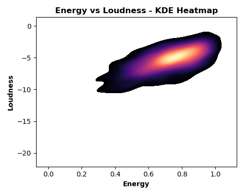
🔊 Energy Meets Loudness
Ever wondered if volume = energy on the charts? To find out, I made a KDE heatmap — basically a musical density map showing where most hits hang out.
Spoiler: high-energy tracks do tend to crank up the volume, forming bright “hotspots” on the chart. A Pearson correlation of 0.654 backs it up — there’s a solid positive relationship. But here’s the fun part: some tracks bring serious hype without blasting your eardrums, proving that you can still dance hard even at moderate volume.
💡 KDE in action: Think of it as a crowd map for songs — you instantly see where the majority of hits cluster without getting lost in a sea of dots.
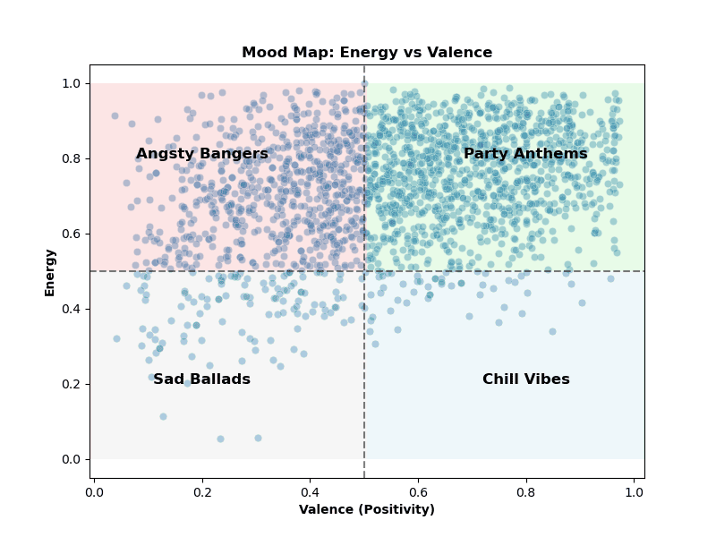
🎹 Mood Quadrant: Where Hits Hangout
To see how songs make us feel, I mapped them across a mood quadrant chart using valence (positivity) and energy.
The result? Most hits live in the high-energy, high-valence corner— basically the ‘Angsty Bangers’ and ‘Party Anthems’. But the chart also shows some surprises: moody or introspective tracks sneak into the low-valence quadrants (the ‘Sad Ballads’ and ‘Chill Vibes’), proving that even sad songs can leave a mark on the charts. Meanwhile, chill yet happy tunes occupy the low-energy, high-valence zone, perfect for relaxing playlists.
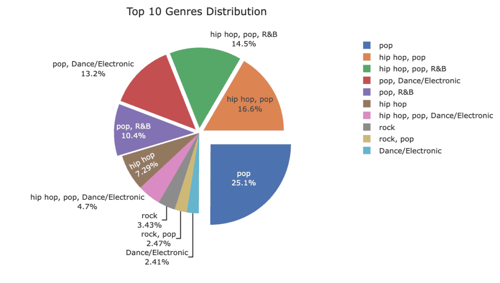
🎧 Genre Evolution: How Our Playlists Shifted
Music tastes don’t stay still, and the charts prove it. Using a stacked area plot, we can see how genres rose and fell from 2000 to 2019.
Pop still reigns supreme, but the 2010s brought a surge of hip-hop, EDM, and alternative tracks, reshaping the playlist landscape. Watching the areas grow and shrink over time feels like flipping through a musical timeline — some classics never go out of style, while new genres make bold debuts.
To complement the area chart, a pie chart of the top 10 genres shows their overall share in the dataset, making it easy to see which styles dominated the decade as a whole. Pop grabs the biggest slice, while hip-hop, EDM, and alternative make up a flavourful mix of hits that defined our playlists.
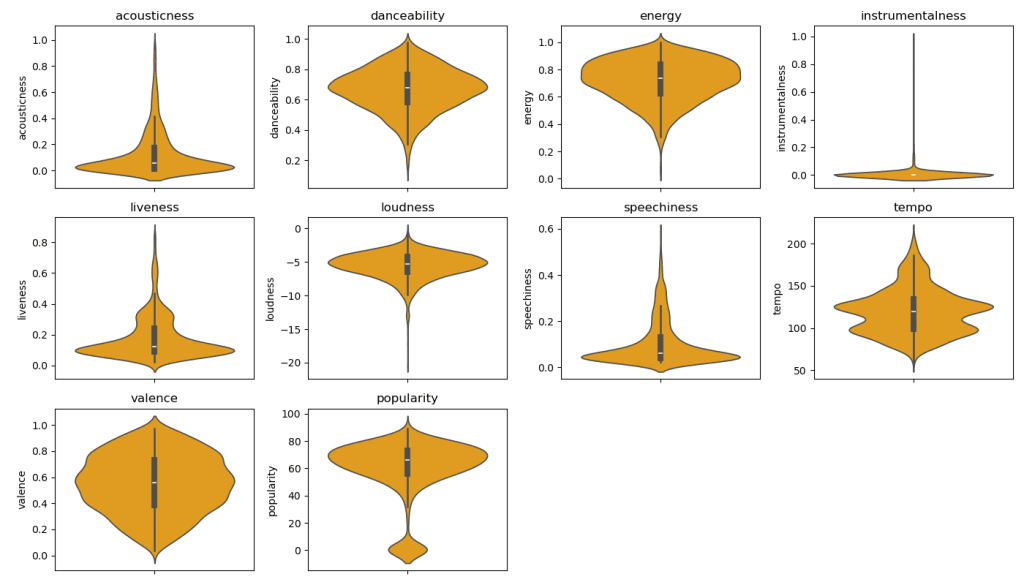
📊 The Anatomy of a Hit
To peek under the hood of top hits, I created violin plots for audio features like danceability, acousticness, speechiness, energy, and valence. These plots don’t just show averages — they reveal the full distribution, letting us see where most hits cluster and where the outliers live.
The story is clear: crowd-pleasers tend to be highly danceable and energetic, while tracks heavy on acoustic or speech-like elements are rare in the mainstream. You can literally see the peaks in the violins where hit-making magic happens, giving a visual fingerprint of what makes a song resonate with listeners.
💡 Why this plot hits the right note: Unlike histograms, they show both the shape and spread of the data, making it easy to spot trends and extremes — perfect for understanding the DNA of a hit.
🔗 When Features Collide
Ever wonder which musical traits love hanging out together? A correlation heatmap shows just that, revealing which audio features tend to move in sync.
Not surprisingly, energy and loudness are practically BFFs, while danceability and acousticness keep their distance on opposite ends of the spectrum. It’s like seeing the social network of a hit song — who vibes together, who chills solo, and what makes a track resonate with listeners.
💡 Reading the friendship map: They turn a jumble of numbers into a visual friendship map of your audio features, letting you instantly spot patterns and relationships.
🎵 Final Notes: What the Data Tells Us
After diving into two decades of Spotify’s top hits, a few things are clear: hits are getting shorter, punchier, and more danceable, major keys still dominate the charts, and while pop reigns supreme, genres like hip-hop, EDM, and alternative reshaped the musical landscape.
Audio features like energy, loudness, and valence aren’t just numbers — they tell the story of what makes a song resonate, and KDEs, violin plots, and heatmaps help us see patterns hidden in the noise.
Whether you’re a data nerd or a music fan, this project proves that the soundtrack of our lives has structure, trends, and surprises — and sometimes the quietest or saddest track can leave as big a mark as the chart-topping banger.
💡 Takeaway:Data doesn’t just reveal what we listen to — it shows why we love it!
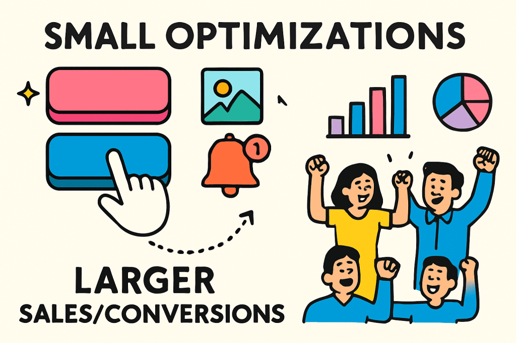
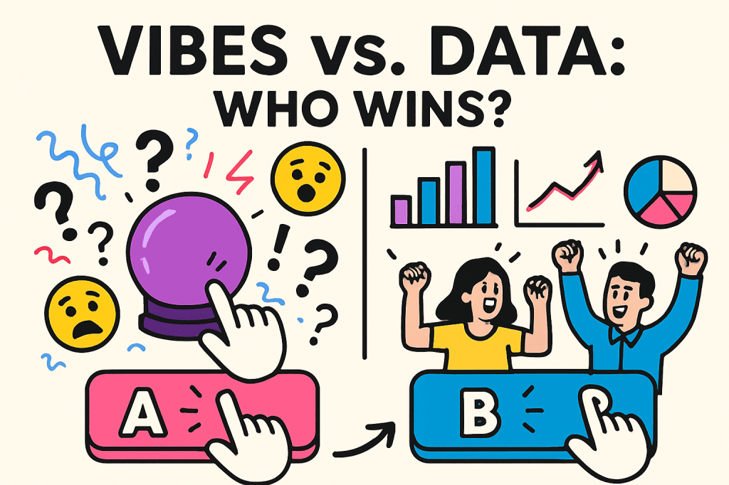
Have you ever noticed how Netflix changes the cover art for the same show? Or how your favourite shopping site quietly switches up button styles? That’s not a random design update —it’s A/B testing in action. Instead of relying on vibes or gut feelings, businesses run experiments to prove what actually works.
For data analysts, it’s the bread-and-butter skill that turns “I think” into “I know.” It’s proof that small experiments can lead to big wins —and that numbers beat vibes every time.
What is A/B Testing?
A/B testing is basically a choose-your-own-adventure experiment for businesses. You take two versions of something—say a website page, an email, or even a Netflix thumbnail—and split your audience randomly. Half your visitors see version A, while the other half sees version B. After collecting enough data, you check which one performs better.
Think of it like a taste test: one coffee made with almond milk, one with oat milk. Instead of guessing which your friends prefer, you let the results speak. That’s the power of A/B testing—turning hunches into evidence and giving businesses data-driven answers instead of gut-driven guesses.
The beauty of A/B testing is that it isolates a single variable, so you know exactly what caused the difference.
Small Tweaks, Big Wins
Here’s why businesses are obsessed with A/B testing: small tweaks, proven through A/B testing, can lead to massive wins. Even a 2% increase in conversion can translate to thousands of dollars for a company like Amazon.
E-commerce: Does “Free Shipping” or “20% Off” drive more sales?
Streaming apps: Which thumbnail gets more clicks?
Food delivery: Does a push notification at 6 PM vs. 8 PM boost orders?
For a junior data analyst, this is where you get to flex. You’re not just cleaning spreadsheets—you’re running experiments that tell decision-makers, “This strategy works, and here’s the proof.” That’s powerful. It turns analytics from a rearview mirror into a roadmap for the future.
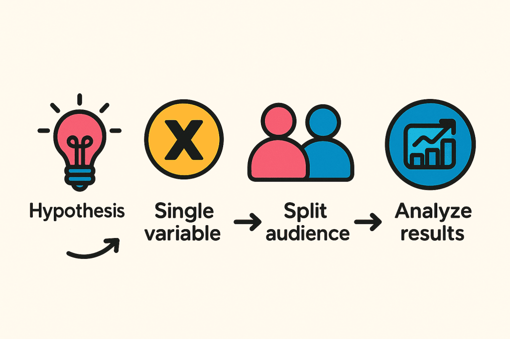
So how do you actually run a test that delivers these wins? Here’s a step-by-step guide:
Less Guessing, More Testing
Running an A/B test isn’t rocket science, but it does take discipline:
Starting with a hypothesis: e.g., “A shorter sign-up form will increase completions.”
Choosing a single variable: don’t test a button colour and a headline at the same time.
Split your audience randomly into two testing groups.
Run the test long enough so the data can speak for itself.
Analyse results: Did your change actually work?
The trick? Resist the urge to celebrate too soon —real insights need time to shine.
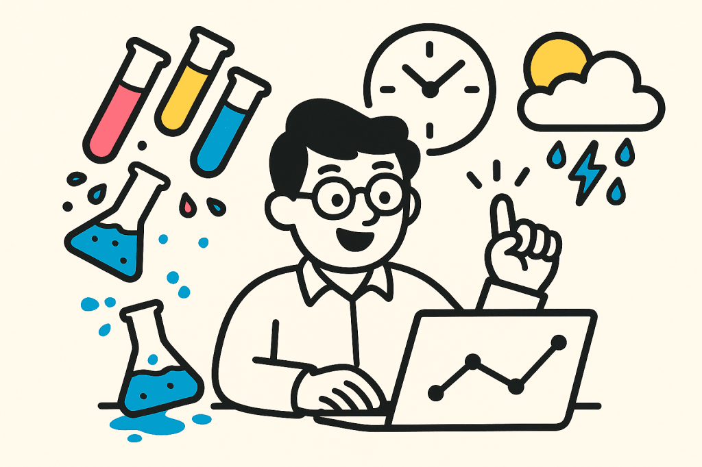
Oops-Proof Your A/B Test
Even the best A/B tests can flop if you’re not careful. Here’s how to oops-proof yours:
Don’t be impatient: calling a winner too soon is like judging a movie by the trailer.
Keep it simple: testing five things at once? You’ll never know which tweak did the trick.
Mind the outside world: The seasonal variations, holidays, ad campaigns, or random events can sneakily mess with your results.
As a data analyst, your job is part detective, part referee—making sure the experiment is fair, the data is clean, and the results actually mean something. Follow these tips, and you’ll turn potential flops into solid, trustworthy insights.
Wrapping It Up: Let Data Decide
Wrapping it up: vibes might be fun, but they won’t drive real results. A/B testing shows that even tiny experiments can spark big growth —and give data analysts a chance to prove their impact.
In business, the smartest decisions aren’t made on hunches or gut feelings—they’re made on evidence. And that evidence starts with something simple: version A versus version B. Let the data decide, and let your insights speak louder than guesses.
🚀 Ready to run your first A/B test? Start with one simple hypothesis and let the data surprise you!
On the far side of the glossy hype lies a jagged landscape of breakthroughs and breakdowns—this is where AI’s future is being forged.
What’s the “glossy hype” we’re talking about? It’s the AI writing code, generating art, eclipsing prior standards. Beyond the showcase lies a messy frontier where novelty meets liability. This isn’t the polished arrival of a new era; it’s a rough, uneven journey where advances and failures share the same path.
Welcome to the jagged frontier of AI: where it gets real.
What Do We Mean by “Jagged Frontier”?
The phrase describes the uneven terrain of AI’s development. Progress isn’t linear–it lurches forward, stumbles, and then surges ahead again.
If you think about it, AI is quite the unknown. No one completely understands the full capabilities of the most advanced Large Language Models (LLMs), like GPT-4. There isn’t an instruction manual to guide the usage of AI. Artificial Intelligence is very powerful–one moment it’s planning the perfect weekend getaway, the next it insists on a non-existent train line that will get you there. That mix of brilliance and chaos captures the frontier perfectly; immense potential tangled with sharp limitations.
Unlike technologies of the past, AI isn’t being quietly refined in labs before release. It’s already out in the world, learning, failing and evolving in real time. And that’s where the jaggedness becomes obvious—not just in theory, but in practice.
Living and Thriving in the Beta Test
Think of AI as society’s beta release: powerful, exciting, and still full of rough edges. In the software world, beta versions are pushed out so developers can gather feedback, uncover bugs, and stress-test systems before a polished release. But here’s the twist—AI has skipped the controlled lab phase and gone straight into the hands of millions, flaws and all.
One day it’s helping doctors flag anomalies in scans with superhuman precision; the next, it’s misreading harmless data and raising false alarms. It can draft business strategies in minutes, but also slip in shaky assumptions that don’t survive scrutiny. It can tutor a student through equations, then stumble on basic arithmetic.
Like beta software, AI is being debugged in real time—not behind closed doors, but out in the open, with society itself as the test environment. The jagged frontier lives in this tension—innovation soaring, errors tripping, and a future that feels more like patch notes than a polished release.
Brains & Blunders: The AI Paradox
🎨 Creative Power: Sparks music, stories and rapid solutions.
🌀 Chaos Potential: Generates deepfakes, misinformation and bias.
⚙️ Productivity Boost: Automates workflows and surfaces hidden insights.
💡 Key Insight: Brains and blunders coexist; society is the live beta test.
Who’s Navigating AI’s Jagged Frontier?
AI’s landscape isn’t empty terrain —it’s crowded and everyone’s moving at a different speed.
Startups: Test bold ideas at a rapid pace.
Tech giants: Build tools and ecosystems that shape the adoption of AI.
Researchers & Ethicists: Raise red flags about bias, fairness, and safety.
Governments & Regulators: Race to establish rules and guardrails, often after the fact.
AI’s frontier is a Wild West of its own—innovators, regulators, and rule-breakers all carving the territory. Will teamwork steer the journey, or will chaos reign?
Embracing the Jagged Path
Plot twist: jagged frontiers are flaws; they’re features of AI. Smooth paths usually mean well-travelled ground; the jagged terrain is where discovery happens in real time.
The unpredictability forces us to take safety, ethics, and accountability seriously. It pushes technologists, policymakers, and the public into conversations we can’t afford to avoid. The friction may feel uncomfortable, but that’s exactly where resilience, innovation, and trust are built. The jaggedness may cut, but it also carves. It’s at these sharp edges that the next chapter of AI is being shaped.
Walking the Frontier
AI’s frontier isn’t straight or smooth—it’s rocky, uneven, and unpredictable. But that’s exactly why it matters. Every stumble teaches us something. Every sharp edge forces adaptation. Every breakthrough pushes the boundary of what’s possible.
Yes, the frontier is jagged. But it’s also ours to navigate. The real question is: how boldly are we willing to walk it?
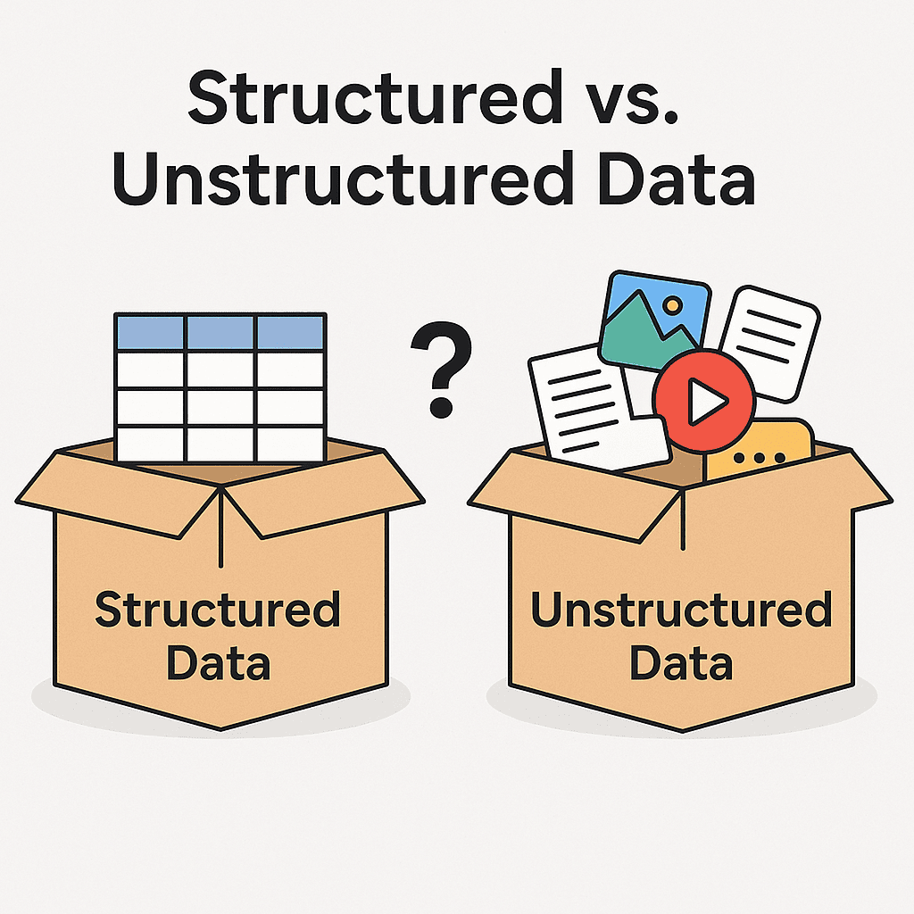
Do you think all data fits neatly into spreadsheets? Well, think again. Your tweets, selfies, and search history don’t follow the rule – and that’s where structured and unstructured data come into play.
Knowing the difference between the two helps you understand how it’s stored, processed, and used to make decisions and gather insights. It also enables you to choose the right tools and approach in data analytics or AI.
📚 Neat, Tidy, Powerful: The Magic of Structured Data
Structured data is what most analysts love: clean, consistent, and query-ready.It is the most straightforward kind of data to work with. It lives in rows and columns, like in a spreadsheet or database – this kind of data enables easy sorting, filtering and analysing of data.
🛠️ Tools: Excel, Google Sheets, PostgreSQL, Power BI, Tableau
🌀 From Emails to Emojis: Unstructured Data Explained
Unstructured data doesn’t follow a fixed format. It is messy, yet valuable. From tweets to meeting notes, it makes up more than 80% of all data today. But because it lacks structure, it needs more work and smarter tools like AI or NLP processing to extract value.
🛠️ Tools: OpenAI, Hugging Face (NLP), speech-to-text, Apache Hadoop, TensorFlow
Unstructured data holds depth, but structured data often drives fast wins. As Pareto’s Principle says, 20% of the data can unlock 80% of the answers.
The AI Implications of Data Types
AI Model Training: Structured data is used for training traditional machine learning models like decision trees and regression, while unstructured data requires advanced techniques like natural language processing (NLP) and computer vision to extract meaningful features.
Data Processing Complexity: Unstructured data demands complex preprocessing steps like tokenisation, image segmentation, or audio feature extraction, which can be computationally intensive. Conversely, structured data requires less processing because it is already organised into rows and columns.
Challenges and Opportunities in AI: The rise of transformer models and deep learning has unlocked the potential of unstructured data, making it critical for innovation in AI-driven fields like healthcare diagnostics, autonomous vehicles, and personalised marketing.
Structured data brings clarity. Unstructured data brings context — once it’s processed. Together, they offer an overview of what’s happening and why. From spreadsheets to social posts, knowing how to work with both leads to smarter, effective decisions.
Have you ever wondered how Netflix always seems to know what you want to watch next? How does your Instagram show you the reels and content that piques your interest? Or how Autocorrect seems to suggest the word you’re about to type next, on your phone or computer?
From personalised shopping recommendations to fraud alerts from your bank, we are surrounded by technology that seems to know what we need way before we do. Behind the scenes, powerful technologies like Artificial Intelligence (AI), Machine Learning (ML), and Data Analytics are working together to learn from your browsing habits, make predictions based on these habits, and deliver the right experience at the right time.
Terms like Artificial Intelligence (AI), Machine Learning (ML), and Data Analytics are often used interchangeably, but they aren’t the same. Understanding the differences between them is key to learning about how modern technology works.
In this post, I’ll walk you through what each of these terms means, how they relate to one another, and how they’re used in the real world, with relatable examples 💡
AI: When Machines Start Thinking
Artificial intelligence is a branch of computer science that refers to the use of technologies to build machines and computers that can mimic cognitive functions associated with human intelligence. AI focuses on creating intelligent agents capable of performing tasks that would typically require human levels of intelligence. These include problem-solving, speech recognition, and decision-making, among others.
Artificial Intelligence systems have three qualities:
Intentionality: They work based on goals and clearly defined tasks.
Intelligence: They use data and inputs to infer patterns and provide answers.
Adaptability: They improve based on feedback and data.
These qualities enable them to make decisions that traditionally require a human level of experience and expertise.
At its core, AI is all about making machines “think” and act like humans do — or at least simulate parts of human intelligence.
AI systems are designed for:
Facial Recognition: AI-powered cameras recognise faces and detect unusual activity.
Fraud Detection: Banks use AI to flag suspicious transactions.
Health Monitoring: Smartwatches monitor health metrics like heart rate, blood oxygen levels, and calculate sleep patterns.
Real-time Traffic Prediction: AI predicts traffic, notifies drivers of accidents, suggests alternate routes, and provides accurate arrival times.
Ultimately, AI is no longer just a futuristic concept — it’s a powerful tool already shaping our everyday lives. Whether it’s protecting our data, navigating our routes, or tracking our health, AI is transforming our ways of working to make our world smarter, faster, and well-connected.
Predictive Power: What ML Brings to the Table
Machine Learning (ML) is a subset of Artificial Intelligence (AI) that enables the development of computer algorithms that improve automatically through experience and by use of data. ML is all about creating and implementing algorithms that facilitate decisions and predictions required to improve the performance of the machine over time, making them more accurate and effective as they process more data.
The concept of Machine Learning focuses on enabling systems to learn from data without explicit programming. In traditional programming, a computer follows a predefined set of instructions to perform a task. In ML, the computer is given a set of examples (data) and a task to perform, but it’s the job of the computer to figure out how to accomplish the said task, based on the examples provided.
To train a machine learning model, you provide it with a wide range of data, and it analyses the patterns by learning from those examples.
Types of Machine Learning:
Supervised Learning: It is the most common type of machine learning. The model is trained using labelled data. (using examples with answers)
Unsupervised Learning: The model is trained on an unlabelled dataset. The model finds patterns in data without any answers. It explores the data on its own.
Semi-Supervised Learning: The model uses a small amount of labelled and a large amount of unlabelled data to learn better. It leverages both supervised and unsupervised learning to improve model performance.
Reinforcement Learning: The model involves training an agent to make decisions by interacting with its environment. The learning takes place through trial-and-error methods
Machine Learning Is Everywhere:
Email Spam Filtering: ML detects patterns in spam messages and filters them out.
Virtual Assistants & Chatbots: ML helps these assistants understand and respond to your questions using natural language processing (NLP).
Language Translation: ML models learn from multilingual text to improve translation accuracy over time.
Machine Learning isn’t just automation — it’s evolution. It learns, adapts, and improves with every click, search, or swipe, silently powering the digital experiences we now take for granted.
From Insight to Impact: The Role of Data Analytics
Data Analytics is all about finding meaning in numbers. It is the process of analysing raw data to draw meaningful, tangible insights that drive successful business outcomes. Analysing the raw data involves uncovering patterns, trends and insights that help businesses make data-driven decisions. Analytics turns information into action.
The Everyday Impact of Invisible Insights:
Streaming Services: Popular platforms like Netflix and Spotify make use of viewing/listening habits to recommend shows or songs based on your past behaviour.
Pricing Strategy: Brands use competitor and demand data to adjust prices dynamically.
Grocery Store Loyalty Cards: Scanning your loyalty card each time you make a purchase enables the store to track what you buy, and your purchase history is analysed to provide you with personalised coupons or promote specific products.
Google Maps or ETA Updates: Analysis of real-time traffic data from users’ phones to suggest the fastest route, predict arrival times and even reroute you automatically when there’s an incident on the road.
As our digital footprint grows, so does the value of data. Analytics isn’t just about looking back, it’s about predicting what’s next. It’s how patterns become predictions and numbers become knowledge. It’s the force powering smarter decisions every day.
Artificial Intelligence, Machine Learning, and Data Analytics might sound complex, but they’re already a part of our lives, shaping what we see, how we interact, and the choices we make online. The more we understand these technologies, the better we can navigate and even influence the digital world around us.
The future is data-driven — are you ready to lead the way? 🚀
I’m excited to launch Byte by Byte — a space dedicated to making the world of data analytics and AI more approachable, practical, and inspiring.
👋🏼 Hi! I’m Raksha, a Data Analyst and AI enthusiast, and I created this site to share my journey, showcase my projects, and help others build their own path in this exciting field.
Here’s what you can expect from Byte by Byte: 🌱 Easy-to-read guides to help you understand complex ideas ⚡️ Practical tips and examples you can apply right away 💡 Thoughtful reflections on the trends and future of data and AI
Whether you’re starting out, brushing up your skills, or exploring new ideas, I’m so happy you’re here. Let’s learn, experiment, and grow together — one byte at a time.
Thank you for joining me! Stay tuned for more articles, projects, and insights! 🚀
If you have questions, ideas, or just want to connect, feel free to get in touch!